Book a Complimentary Discovery Call
Speak with our Principal Interior Designer, Dana Feagles.
Tell us about your project, your needs, your hurdles, and your aspirations.
Learn how we can help.

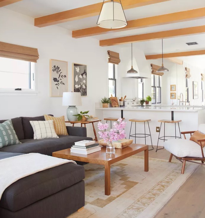
An open concept plan connects your living room, dining room, and kitchen spaces into one large, open area. While some say they are trending out of style, an open concept kitchen and living room is great for creating an open, airy feel in your home. By eliminating walls and barriers that separate rooms, you create an easy flow from one space to the other, with a visual effect of more space.
At Revelry Interior Design, we have at least 3 examples to show you of amazing open concept spaces we have very recently designed. Therefore, it would seem that open concept homes in Sonoma County, Marin, and Napa remain very popular. There are some reasons for this, which I will explore in my post. Also, below I will show you examples of how we’ve brilliantly transformed enclosed living spaces into more breathable, bright open concept plans.
The main advantage of an open concept plan is that it creates a feeling of spaciousness and fluidity throughout the home. Open concept plans also make it easier to entertain guests, keep an eye on children or pets while cooking or relaxing, and also to move between spaces.
Open concept plans can have some downsides, such as a lack of privacy and difficulty creating separate zones for different activities. Additionally, heating and cooling a large open space can get costly. If not designed properly, an open concept plan can feel cold and looming.
Here are 3 open concept plans that Revelry Interior Design has recently helped homeowners successfully design in Sonoma and Marin Counties!

The kitchen is often the focal point of an open concept floor plan. Additionally, and in my experience, homeowners who are converting to an open concept want their kitchen to be larger.
For my Healdsburg client, I was tasked with redesigning their already-open space so that the kitchen looked and felt updated, larger, and more welcoming. Her home has beautiful views of the Healdsburg landscape, with hills and vineyards steps from her backyard. So, maintaining the views was priority #1.
Here is the ”before” floorplan:
As you can see, the kitchen is restricted to the corner of the space. Meanwhile, the living space is extra large, and there is no defined entryway. My clients wanted a larger kitchen with a walk-in pantry, and an actual entryway where they could sit, put on shoes, place bags and coats, etc.
Here is the new design plan I created:
Voila! A walk-in pantry, a defined entry space, and lots of added built-ins in the living and dining spaces. (I even managed to squeeze in extra built-in storage in the two guest bedrooms/home offices!). We also maximed the Healdsburg views by adding large windows which run the full length of the kitchen and dining walls.
In order to make this plan work, we had to forfeit the laundry room – kind of. It became a pass-through laundry room from the garage. For the homeowner, this was a fine compromise in order to make her kitchen larger and more functional.

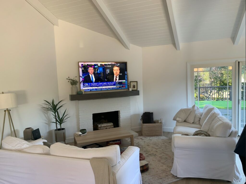
For my Mill Valley client, I was tasked with making their living space feel more functional and breathable. Here is the “before” floorplan:
As you can see, the two sofas don’t create an inviting seating area, and they wanted their open concept space to feel more welcoming. With a beautiful view of Mt. Tamalpais off of their outdoor space, they also wanted to maintain easy access to their 2 sliding glass doors.
Here is the design plan that I created:
Much more open and welcoming, isn’t it? The big challenge with this space was the angled fireplace wall. My suggestion was to have a rug custom cut and bound to fit around all of the odd angles. For a custom product, it’s surprisingly cost-effective. In the long-run, it will create a space that seems much more finished and cohesive.
Notice there is no area rug under the dining table? This services 2 purposes. Firstly, I tend to avoid rugs under dining tables (click the link to read why). Secondly, it makes the dining space feel a lot less cramped, opening up the narrow walkways to the patio doors. Basically, a rug here would have felt forced.
BONUS: Below are the Design Development Boards that go along with this space.
Now, this one was a challenge! I absolutely thrive on space planning challenges, though!
For my Santa Rosa client, I was tasked with not only making her kitchen larger, but converting the 3 separate kitchen, living, and dining spaces into one open concept plan.

We had several site constraints. First, a support post smack dab in the middle of the space. Second, a load-bearing wall at the entryway. These two items would have to stay.
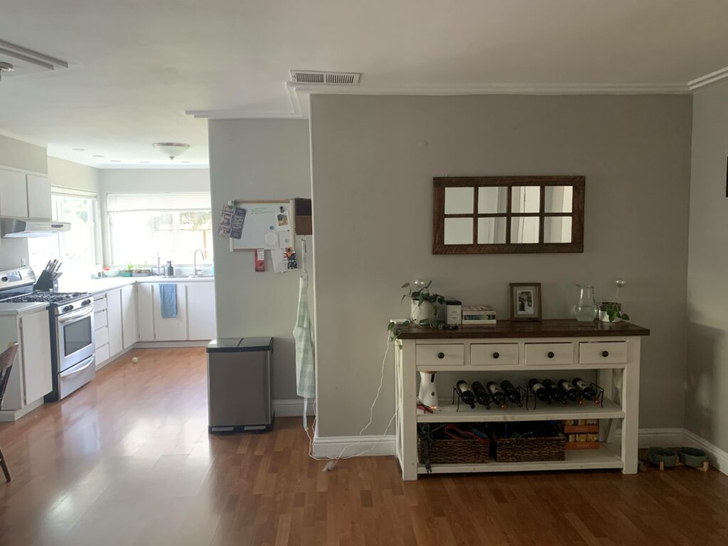
Here is the before:
It feels so boxy, doesn’t it? One of my client’s complaints was that there wasn’t easy flow from the kitchen to the outdoor space. When enjoying her backyard, she (and her guests) would have to walk through the living room, into the entryway, through the dining space and around the sharp corner just to retrieve a beverage from the fridge. There must be a better layout, right?
Turns out, there were several better layouts.
This project is still in the design stages, so we haven’t selected a final plan yet. But here are the top 2 layouts that my client is still deciding between (based on cost estimates from her contractor).
By punching a hole in the kitchen wall, we are able to keep the support post hidden, while still opening up the flow between the outdoor area and the kitchen. My client was concerned that pass-through islands are outdated. They’re not! Check out these modern, welcome, and charming pass-through island designs.
Notice in the plan how the dining room is still adjacent to the kitchen. This is ideal in any home layout, as it creates an easy flow between the spaces. You don’t want to hike with a pile of dirty dishes all through your house.
If we incorporate the support post into the design, rather than trying to hide it, we are able to get a much bigger island and kitchen. It would look something like this.
I think that incorporating the support post brings charm and character to the space, don’t you? In a sea of white, sterile kitchens, more personality is a good thing.
My client loved this design plan and it serves her functional and aesthetic needs perfectly. And I agree. Stay tuned to see which layout my client ultimately selects, and then the fun part begins: materials selection!
Reach out to us at hello@revelryinteriordesign.com or book a free consultation with us here.
Cheers!
Dana
Speak with our Principal Interior Designer, Dana Feagles.
Tell us about your project, your needs, your hurdles, and your aspirations.
Learn how we can help.