Book a Complimentary Discovery Call
Speak with our Principal Interior Designer, Dana Feagles.
Tell us about your project, your needs, your hurdles, and your aspirations.
Learn how we can help.

As an interior designer, one of the first things I always recommend to a client who feels as though their room is “unfinished” is to get some artwork up on those blank walls! The impact wall decor can have on the overall “finished” feeling of a room is vastly underestimated and frequently overlooked. So I put together a little guide on wall art hanging rules.
You can bet I was excited when I was interviewed for an article in Homes & Gardens Magazine titled “Expert Designer Tips: Should every wall have something on it?” Spoiler alert: the answer is “it depends.” Click the link to read expert advice from an array of interior designers, and then read on for my expanded tips and tricks below.
Too much reading? I hear ya. Book a Discovery Call if you need a pro to help you out.

First of all, there are two types of walls: those that are completely empty, and those with architectural features such as windows, doors, openings and fireplaces. They each have different rules.
One of the most common interior decor mistakes I see is wall art that is not properly proportioned to the wall – usually, it is too small. Avoid this mistake by remembering the rule of thirds.
The rule of thirds: take the width of the wall, divide it by three, and that number should be the minimum width of your wall decor, centered on the wall. So, if your wall is 10 feet long, your picture (or overall width of your gallery wall) should be no less than 40 inches wide.
The key phrase is “no less than.”
The same rule of thirds applies for the height. If your ceiling height is 8 feet high, then the height of your wall decor should be around 32 inches.
If you have a wall with an architectural feature that breaks up the space, such as windows, doors, openings and fireplaces, the rules are a bit more nuanced.
I like to use a 50/50 rule. Let’s say you have a wall that is 10 feet wide with a 3 foot door right in the middle. That leaves 42” of wall space on either side of the door. Your wall decor should be no wider than half of that, or 21”. Anything wider than this will make the wall space feel crowded.
For the height, you have much more freedom, since the doorway provides a visual vertical anchor. It can be charming to have three smaller pieces hung vertically (the center one hung at 57” high on center), or more striking to have one tall piece, again hung at 57 inches on center.
Don’t try to align the top of your wall decor with the top of your door or window trims – this will make them much too high and will make the space feel “off.” Instead, consider your height – you want your wall decor at your eye level, especially if it’s a mirror!

There is no limit to the number of frames you can have within the space defined above.
You have to think of it like a puzzle – the more pieces you add within a set boundary, the smaller the pieces have to be.
You can have one 40-inch-wide artwork, two 2-inch-wide artworks hung 4 inches apart, or five 7-inch-wide artworks hung 1 inch apart.
You do need to do a little bit of math and map out your grid before you pick up the hammer! (Am I the only one that finds joy from this math homework? Yes? I guess I’m in the right profession . . . )
The general rule for the hanging height is 57” from the floor to the center of your wall decor (this is eye-level for the average person).
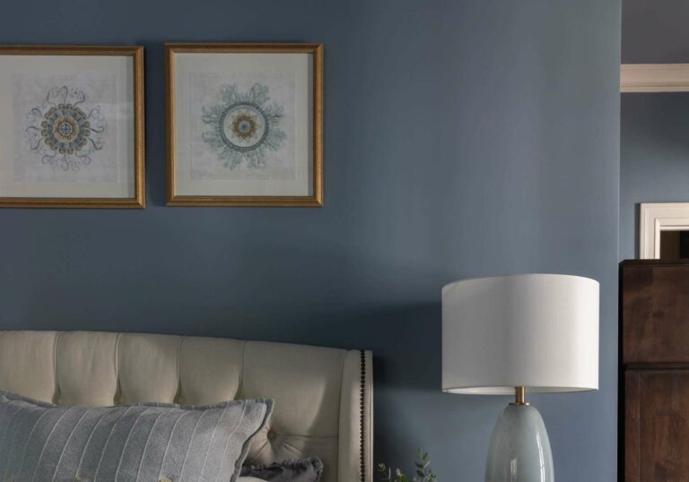
When in doubt, hang lower and not higher, especially if you are hanging your wall decor above a piece of furniture like a console table, bed, or couch.
You want the wall decor to feel a part of a cozy little vignette, not floating high above it, which will distract the eye and lessen the design impact.
As I mention above, there are two types of walls: those that are completely empty, and those with architectural features such as windows, doors, openings and fireplaces. They each have different rules.
For blank walls (those without any windows, doors, etc.), it’s a good idea to have a proportionally balanced frame on the wall to avoid the empty, unfinished, looming feeling that a blank wall can create. (See my rule of thumb above!)

For walls with architectural features that break up the space, such as windows, doors, openings and fireplaces, again the rules are much more nuanced.
Generally, if the width of your wall space is 24 inches or less, don’t worry about needing to hang any wall decor. Chances are, there is enough visual interest to balance out the wall already, such as windows or doors.
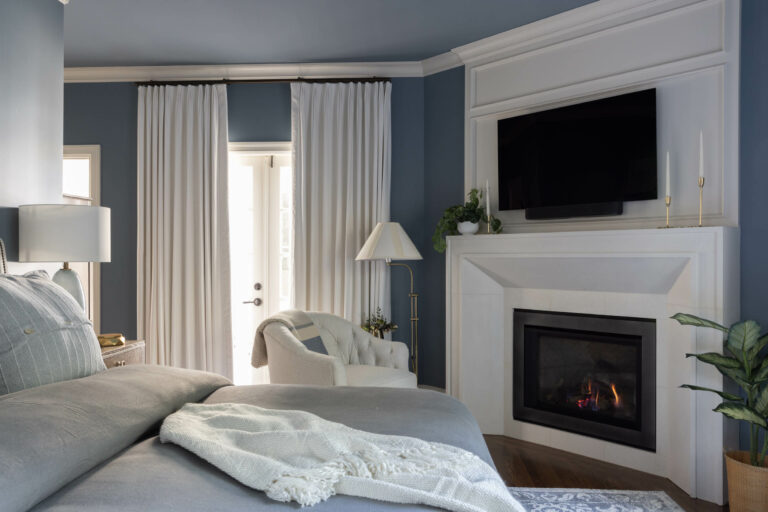
I always recommend hanging something on an empty wall above your fireplace (a large mirror or painting is preferred over a TV screen, but sometimes this is the only place for a TV, and that’s okay!).
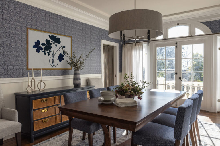
Furthermore, if the width of your wall space is more than 24 inches – for example, from a corner to the nearest window trim – my 50/50 rule would apply (see above!). Just make sure you can balance it out on the opposite side of the window or architectural feature with another picture frame, or even a tall vase sitting on a console table, or perhaps a tall reading lamp next to a seating area.
I always stand back and look at my walls as a whole to determine if they feel balanced. If one side feels heavier, either because of furniture, windows, a fireplace, etc., it’s a good idea to balance out the lighter side, and wall decor is an easy solution.
Cheers,
Dana Feagles, Principal Interior Designer and Wall Art Aficionado
Speak with our Principal Interior Designer, Dana Feagles.
Tell us about your project, your needs, your hurdles, and your aspirations.
Learn how we can help.